This is a tiny lesson in design I learned at Freshworks. The lesson seems obvious in hindsight, but it wasn’t so obvious when we were making the mistake.
So, Freshdesk is used by customer support teams day in and day out. When these teams log in to Freshdesk, we show them conversations their users had sent in over email, Twitter, Facebook, etc – in one place.
These customer support teams can pick between two different views to see these conversations when reading them on Freshdesk.
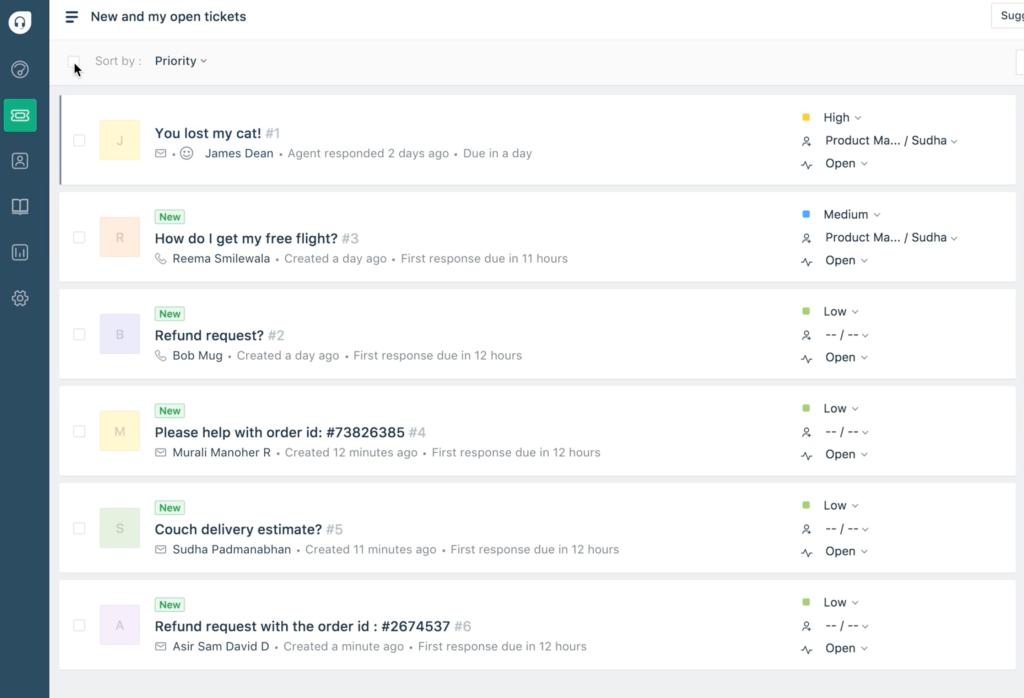
One view was called the card view. The card view is quite similar to how emails appear today in mobile Gmail. It was the default, and it looked like this:
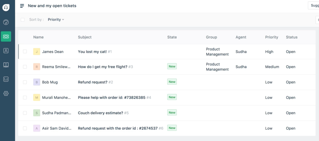
The other one is table view, which looked more like a spreadsheet. Beyond just the subject, you can also gather additional details users may have filled in when they sent in the conversation (via a form, for instance). Table view looked like this:
To switch from card view to table view, teams had to click on these tiny icons:
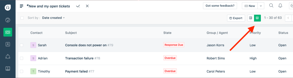
When we got on calls with teams that used Freshdesk, we were surprised that they hadn’t discovered table view until we told them about it.
A person actually told us that the icon we had used to represent the table view was too small, and it appeared like a calculator and not actually a table.
The first time I heard it – I’ll be honest, I chuckled. Then, I went back and thought about it and felt he was totally right. We had all sorts of icons (with no supplemental text) that made no sense to our customers.
That’s when I learned a design lesson that I carry in my heart till day.
Everyone’s muscle memory recognises the icons for ‘Save’, ‘Delete’ and ‘New’ as ‘something that looks like a floppy’, ‘a bin’ or ‘a plus’, respectively. And they know what these icons convey in the apps they’re seeing them on.
But the products we’re building these days have more than just these universally recognized actions. Brand new icons you may be using to represent these actions aren’t part of anyone’s muscle memory (like the floppy or bin icons).
If your product has a button to let sales people change the deal stage, it cannot be just an icon. It’s got to be supplemented with text.
If you’re building a feature where you’re taking people to a ‘focus mode’ to do some intense work using a button, you can’t have just an icon to represent it.
Sure, your designers and product team might love having just icons to represent these actions to save space but your users will:
1. end up rarely noticing the icon if it’s not a frequent action.
2. when it’s a frequent action, they’ll click on the icon,
3. realise they clicked on the wrong one,
4. then go on a trip to find what they actually want to click on,
5. then click on the right one after some retries.
It just doesn’t work when someone says “we can just use an icon and get rid of the text to save some space in the screen.” By doing that, you’re not saving space – you’re actually causing a usability problem that your customer base will run into hundreds or thousands of times a day.
So, here’s the bottomline:
More often than not, content eats icons for breakfast. Any action that’s not universal like ‘save’, ‘new’ or ‘delete’ must include text.
By doing this, you actually eliminate the thinking required by your users every time they’re trying to click on that button.
If you have 1000 users, and on average, if one user does an action that’s represented by only an icon 10 times a day, that’s 10,000 confused and unsure clicks.
Ten thousand literal moments everyday when people are spending a few seconds to figure out if they’re clicking on the right button or not.
Eliminate those 10k*2 seconds = 5 hours by just adding relevant text to those icons 🙂
You’re not just saving those 10 seconds, you’re saving customers from feeling stupid, which they should never feel when using your products anyway 🙂
 Shankar is thinking
Wholeheartedly agree to the whole concept you’ve mentioned here, Shankar. Although I’ll have to slightly disagree on the “Everyone’s muscle memory recognises the icons for ‘Save’, ‘Delete’ and ‘New’ as ‘something that looks like a floppy’, ‘a bin’ or ‘a plus’, respectively.” given my experience of navigating prospects through the same tool you’ve mentioned every single working day for the last five years of my life.
I’ve learnt that this purely depends on how comfortable a user is when it comes to navigating softwares, and the majority of them still need better guidance by simply putting out the name versus an icon to represent a function. For instance, I still struggle to explain how to navigate users between Solutions, Forums, etc. on the left hand side given the obvious lack of words in front of my screen. I also learnt that the three striped lines (Not Adidas, folks!) on the top left hand corner is actually called a “Hamburger” icon. Frankly, I don’t think a common user will know that unless they’ve worked in UI/UX design!
Some changes to these would drastically improve the lives of my prospects who aren’t as tech savvy as the ones sitting in the Bay Area and definitely mine as well!
LikeLike
The point you’re making is exactly the point I’ve made in the post 🙂
I meant to say that icons that are typically used to represent ‘Save’, ‘Print’, ‘Delete’ etc. are universally recognized whereas most other icons aren’t. Therefore, it doesn’t make sense to just use icons for these uncommon actions.
LikeLike
This is a new insight to me, Shankar. I’d love to know how you end up solving this particular usability issue(I shouldn’t be saying issue, but couldn’t find the right word). Did you end up having icon postfixed by a small text? Or what was the solution in here?
LikeLike
Naveen,
We removed the icons and replaced them with a dropdown. The dropdown had two choices: ‘Card view’ and ‘Table view’ (just text)
LikeLike